In this article, I will tell you about my experience with the Seiko Brilliance progressive lenses. First of all, you should know what exactly I was wearing during the test so let us talk some facts here.
| Model | Brilliance |
| Corridor Length | Medium |
| Design Type | GCCC |
| Coating | Super Resistant Coat (SRC) |
| Material | 1.6 |
I ordered the Seiko Brilliance lenses with an Add value of 2.00 Diopters. Most wearers of progressive lenses with an age over 50 will need this amount of reading support. The Add value heavily influences the blurry fields of view in the lower part of every progressive lens design.
First of all the start with the Seiko Brilliance lenses was quite easy. At this time I am used to progressives and tested a lot of them. When I tried them on for the first time my first task was office work on my 15 inch laptop.
There I had the same experience as with other high-end progressive lenses. One-third of the screen appeared clear and the outer 2 thirds will be a little blurry. The more you perform eye movements into the side of the screen the blurrier it gets.
To be clear. When I talk about blurriness I talk about a slight blur. In some cases when you perform eye movements to the side you will notice some shadow effects or double contours in the characters. I am still able to read but at the beginning of this blurry area but you will start to point your nose in the direction you want to see clearly.

If you work on text that is centered on the screen this is totally fine. If you perform tasks that would require your attention on the sides of the screen I would switch to reading glasses or computer glasses.
The shapes in the lower part of the lenses show a minimal bend or sphere-like effect. After a few days, you will get used to it and you will not notice it anymore if you do not concentrate on it.
The situation I described can change for you depending on what design type you choose. Oftentimes nowadays you get the options to influence the lens design by the information you provide about your lifestyle.
If you order the Seiko Brilliance you will get asked a bunch of questions about what activities are important to you while you wear these lenses. Seiko shapes the lens design to match the field of view to your activities with the distances of those own mind.
This is how the code GCCC for the design type came up. It was generated on the website I will link below.
What Exactly Is Influenced by the Design Type When Ordering the Seiko Brilliance?
Your choices influences three things in the lens design:
- How much you need to look down to get full reading support
- How hard or soft the lens design will be
- How big the field of view in the mid-distance will be
One of the questions for example is what progressive lens you wear before and if you liked it or not. With the knowledge of how your old glasses worked Seiko will match the algorithms to produce a similar result if you liked your old pair of progressives. Even if your old progressive lens design comes from another manufacturer.
Here is the website for the design selector. You can go through the questions you will be asked by your local optician.
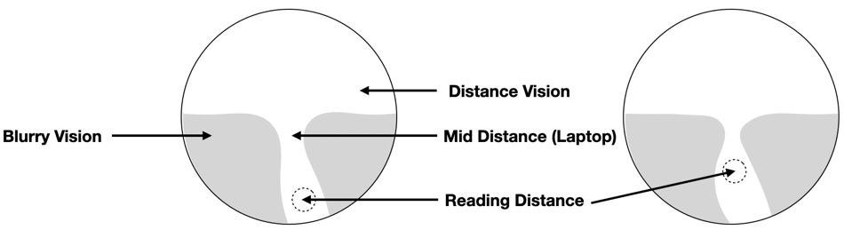
As you can see in the picture above the area for the reading distance is lower positioned on the left and higher on the right. This means on the left you need to perform bigger eye movements down to reach that area for full reading support.
Most people first tend to the option on the right in which they do not need to perform eye movements as much. But this comes with a downside. The area which is already the smallest the mid-distance gets even smaller.
If you do not need this area anyway that is fine. But this is one thing that will be influenced by your given information. Let us go to the next part. The hardness of the design.
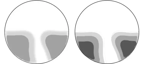
As you can see in the picture above the white area differs on the left side of the picture to the right side of the picture. The white color illustrates the areas for clear vision. The grey areas indicate blurry vision and the darker the grey gets the blurrier your image will be.
If you pay attention to the white areas you will notice they are a little bit wider on the right side. This means you will have a clear field of view which is bigger on the right side with the harder progressive lens design compared to the softer design on the left side. But the downside is: If you perform eye movements near the blurry areas blurriness will be even more noticeable.
In most cases, Seiko will give you a progressive lens design that stays on the softer side. Because as history showed they tend to have a bigger acceptance.
How Big Is the Field of View?
Your width of the clear field of view will probably differ from mine. Depending on the corridor length and the Add value you need. But here in the picture below you can see what I can see clearly. I used my iPhone 11 Pro Max for this test. Holding it in portrait mode presented me with the whole screen really clear from side to side.
In landscape mode, you will immediately notice the blurry areas. If you have text on the screen displayed from side to side you can see the limitations of the lens design.
The result is extremely comparable to other high end progressive lenses when it comes to the width of the clear field of view in the reading area. In the periphery while driving my car I noticed only a minimal amount of blur in the upper half of the lens design.
Overall I liked those lenses a lot. I wore them during the day and I just had an easy time with them. On multiple occasions, I thought “hey the field of view or the blurriness in the periphery was better than other high-end lenses”. But frankly spoken this was not the case.
When I switched back to other lenses I noticed the effects I thought were significantly better actually were comparable. At this time I had the progressive lenses from Leica handy and compared them looking at the stairs, looking through the blurry zones by performing eye movements, etc.
The Coating SRC (Super Resistant Coating)
The SRC is a multilayer coating that makes your lenses more scratch-resistant and makes it easier to clean. Of course, this coating also provides youth an AR anti-reflective coating. I want to point out that every one of the aspects of the coating is on the very high end of what the optical industry can produce.
The AR barely shows any reflections, has a very subtle color, and is better than most anti-reflective coatings you will get with other brands. But Seiko is well known for its extremely good and durable coatings. I can highly recommend the SRC. We did tests in our optical shop and it definitely takes more to scratch this surface compared to other brands.
Not that the surface is indestructible of these progressive lenses. But realistically speaking with the SRC on your Seiko progressive lenses they will look less worn out after a couple of years. Those little scratches on the surface just take longer to accumulate.
Summary: What I Like and What I Did Not Like
I could not find a point that annoyed me with the Brilliance progressive lenses. They just worked really well. I had no color fringes as with the Zeiss Individual 2 or the Essilor Varilux X. The field of view is comparable to other high-end brands. I can only say they are a good choice and I can recommend them.
I wish you a great day.